

Today I was at an author event where the author was discussing his book covers. He actually had some fascinating thoughts on them (more on that in tomorrow’s post) but one thing he mentioned stood out to me. He has a cover with a little girl on a tricycle peddling away so you do not see her face, he said he had her riding away as when you see the face on a cover it gives you an image of what the character looks like and he feels that should be part of the reading experience; to create the character in your mind.
Part of the reading experience should be to create the character in your mind.
Ooh…. I like that.
I have always had a sort of dislike for covers that have a picture of the characters on them. Why? Because that image is now in my head as I read the book. The girl (or boy) on the cover is now who is running through the pages which is fine if it is a move cover as we already have the character defined for us by the big box… but not for the original pre-movie (or no-movie) book.
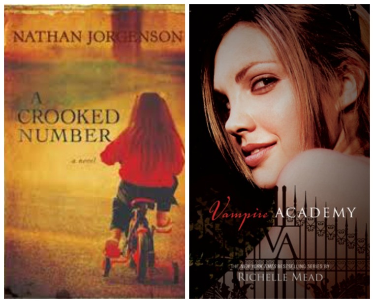
Ok so above – is my example. To the left, is the book I mentioned from the author today. It is an engaging cover and I like it… I want to know where she is going, or where she has went, or who has taken her…. the only thing that would bother me here is if the girl in the book has long flowing BLOND hair, or if her hair is short, unlike the cover. To the right, is Vampire Academy. Nothing against the book… but this girl on the cover makes me think of an older girl than the protagonist in the book.
There have been books I have read that the character inside the book is NOTHING like the cover picture and I can not even tell you how bat sh** crazy that makes me. I seriously flip from the cover to the page I am reading to the cover again… if the girl (or boy) on the cover is not the one described in the book, then who is she or he?
There is one instance that comes to mind from a few years back where the cover actually caused an all out battle. Seriously… anyone remember LIAR?

LIAR is the story of Micah who is well… a liar. And I will say she is! Or at least the people who made the cover are, because Micah, is an African-American girl… not at all the one in the cover. There is a HUGE story behind this cover and there was a refusal by bloggers to review the book as they were all so upset that the publishing company went with a white girl on the cover. Seriously…. this is a whole other story so Google it someday, but the ending result of this battle was:

Yup. Seriously amazing… and all of this could have been avoided.
I really prefer non-face covers. Give me a lake setting, a boat, abandoned car, a road, a house, even people way in the background so you can not really make them out… you name it… I can pretty much work with it… all of these lead me into the story…
“Who lives there?”
“Where are they going?”
What is going to happen?
What are your thoughts on book covers? Preferences? Do you mind faces on book covers? How do you feel when the cover does not match the story?


I dislike faces on book covers so much that unless I’ve heard great things about the book from trusted sources or know the author personally, I won’t bother to even pick up the book and read the synopsis!
Wow! Thanks Beth! This is great feedback from an author!
Faces leave so little to the imagination! Not that I dislike it but sometimes you paint a totally different picture in your mind of how a character looks like (which is why I also sometimes hate it when a book I love becomes a movie!).
Thanks for the comment! I love it when books become movies because I am thinking “YAY” for the author, but yeah…. I hate it when they cast wrong…. LOL we as readers take such a personal interest in this.
I prefer “non-face” covers as well but have to say I didn’t like the trend of having headless women on covers that was so popular a few years ago.
Excellent point Kathy – I didnt like that either.
I’m with you AND Kathy. Headless women are never good! I can’t believe that story about the LIAR cover – what were they thinking?!
I met the author of The Evolution of Calpurnia Tate several years ago, and that was the first time I learned that authors often have very little input into their cover art. She had for this book and was really excited about it. I do think it’s a lovely work of art.
https://www.goodreads.com/book/show/6202556-the-evolution-of-calpurnia-tate
“Off with her head!” lol
Had you heard of the Liar controversy before Karen? I was a fairly new blogger then and stayed away from the hype but at the time it was being discussed everywhere on the blogs and on Twitter.
I knew about the authors having little say in the covers, and if I remember correct,, the author of Liar was also not thrilled with the publishers choice. Off to check out your link now 🙂
No I’d never heard about it.
Of my first five novels, only two had faces on them, and afterwards I had second thoughts about this. The others either had faces turned away or the faces were very small in comparison to other objects.
My newest book, Interior Designs, has a young woman turned away, but I had her with blond hair, like the MC. That kind of thing is important to me as a reader, so I wanted to make sure of that detail.
Wonderful comment Laurel. Did you have some say in your covers? You are right, the look of the person on the cover is very important to match the person in the book.
Yes, I did have a say in the covers…and I learned from experience, which is why I am very pleased with my newest one.
Thats cool Laurel! Great input!
My book club has discussed this with a few authors. Sometimes we don’t understand the cover…. we learned that often the author has no input or needs to decide how important this ‘negotiation’ is. I h.a.t.e it when I have a character in my head, based on the cover, and the author describes someone completely different. I remember once reading a book with a blonde gal on the cover, the author’s description was blonde. ugh!
That’s how I feel. I would rather make the person in my head. I would be fun if we all gave our opinion on what a popular character looks like to each of us. Not one that has been a movie – but completely designed in our mind from the authors description. I wonder how different the characters would look? 😛
I am also a huge believer in books without cover models. I hate when all I do is compare the person in the story to that of on the cover. Wonderful post.
Ashley
Thanks Ashley – it is good to see that I am not the only one. It is funny then that publishers continue to go that route. I wonder if it makes a difference in genre? For instance I wonder if the YA bloggers (where you see a lot of faces on covers) mind as much?
I’m not a fan of faces on covers for exactly the reasons you mention. Often the person on the cover looks NOTHING like the person in the book. I recently read Stephanie Saulter’s Gemsigns (which was totally awesome!), and the face on the cover is an attractive light skinned woman with short dark hair. There isn’t anyone in the book who matches that description! And speaking of Liar, there was a smaller debacle a couple years ago when Sarah Zettel’s Dust Girl came out. The main character is bi-racial, her father is black and her mother is white, and Zettel provides very good description of exactly what she looks like. So they put a caucasian looking girl with wavy hair on the cover. Not cool!!!!
Great comment! Thank you for adding to the discussion and how interesting that the “Liar” case happened again! The publishers reasoning was that they felt a Caucasian girl on the cover would sell better than an African American girl on the cover… just typing this makes me so mad!
I agree with you, I prefer not to see a face on the cover. I want to imagine the characters myself. Some times the title don’t make sense to me either.
Titles… a whole other topic…..lol
I love how I’m not racking my brain for covers with faces that I either did or didn’t like! I will say that I don’t like it when I read a book with a setting on the cover and realize it has NOTHING to do with the book. Patti Callahan Henry had a cover like this, and she told me she has editorial veto to some degree but even after as many books as she’s had she doesn’t get to choose her covers. Great topic and it makes me think because I am drawn to covers when choosing books. 😉
I love covers 🙂
I prefer no face especially if the cover model looks nothing like the character. One of my pet peeves is when the same cover model is chosen for multiple books by one author, especially if the model looks nothing like the character.
Oh ugh – right! I didnt think about that…same model – that is a whole new level of nuts! 😀
I don’t mind faces on the cover as long as they look like the main character(s) in the book. Faces turned away, in shadow, half hidden, or silhouetted are better yet. No face is great. What drives me bonkers is when a cartoonish looking cover is used on a book having to do with a serious subject. It’s hard to take seriously a book about a murder mystery when the cover looks like it was done by Looney Toons. I usually walk right by those books. I believe the author should have the most say over the cover art. After all, this book is their baby.
Thanks Lori! I think there should be a happy mix of author and publisher on the cover. I get that the publishing houses have the experience in what sells, but they should have input with the author as well.
Very interesting topic indeed!
I am so torn. You wrote,
“he feels that should be part of the reading experience; to create the character in your mind.”
I think that I agree with this. Yet part of me longs to have some help at filling things in. Given the choice of seeing a picture of a character or not I would see the picture. I could not resist. Yet in the end it MIGHT detract at least a little from the reading experience.
Thanks Brian, that is good feedback! 😀
I tend to avoid books with photos on the cover. I prefer a cover that has artwork hinting at the story.
I do love great covers! I think as you are mentioning here, that there is so much that a cover can pull from a story… it does not have to be the people… but the places or the things are pretty great for cover art.
The Liar fiasco is ridiculous!! I would have protested as well! I don’t like faces on covers – for all the reasons most have mentioned. I like to picture them all on my own 🙂 Unless it’s an author I trust, I’m not likely to try it out. I sometimes feel so snobbish, but at least I’m honest right? 🙂 Here’s a post I did that included more thoughts and covers I love: http://booksandbeverages.org/2014/01/07/confessions-7/ 🙂
I too like to create the character with no help from the cover 😉
My dream book covers are just the title and a color. If there has to be something on the cover have it be a generic tree, bird, or something that is not focal to the story. Even houses can be wrong, in the story it is a shotgun house on the cover it is bungalow. Really!?
shotgun house? I have to look that up 😛
I don’t care for faces on covers. Sometimes they are so far off the mark, too. I prefer fancy fonts and abstracts to convey feeling.
Thanks Ti!
I don’t mind them. If they are done right.
It surprises me how a publishing company would put a person on the front that does not resemble the protagonist at all.
Actually, I’m not crazy about most covers with photographs, but especially photographed faces. I don’t want to be told, to that degree, what a character looks like. It’s a model’s face, you know it’s a model’s face, and I feel like it takes away from the book. When faces and people are on covers, I want to see illustration.
Thanks Donna!
Hmmm…my comment didn’t show : /
Anyway, I don’t generally like photos on covers, but especially ones with people or faces. I don’t want to be told what my character looks like on a book cover. And so many of the covers are similar. I really get tired of seeing models in gowns, etc. Give me something beautiful and unique that depicts the book more than something so mundane (well, it’s become mundane). And if you want to depict people and faces—illustrations, please 🙂
I see both your comments 😀
Yeah, I think I’m just having server troubles *sigh* sorry for the double post!
Oh yeah – I see that even your name changes on the posts…. hate it when that happens 🙂
I hate movie-tie in covers! Even when buying books for the school I avoid the MTIs as much possible, and it always sucks royally when it’s all that’s available 😦
I dont mind the movie covers so much as by then .. they have cast the characters and we know what the movie world thinks they look like 😀
Great question. This reminds me how my mum didn’t like how one book I recommended to her had a model on it. I didn’t care back in the day but now I think I prefer faceless because it leaves more to the imagination.
I agree… that is the beauty of books… each one of us can read it and have a totally different image of the characters, the land, etc… and that really is the beauty of reading. 🙂